Travel Quest
Travel Quest
Game Inspired
Travel App
Game Inspired
Travel App
Game Inspired
Travel App
Travel Quest

In this project, our class needed to design a unique travel app. The app required a minimum of at least six screens, an icon set for app navigation, Illustrations/diagrams showing the places the travel app will take the user, and an appropriate selection of typographic elements to support visual content
In this project, our class needed to design a unique travel app. The app required a minimum of at least six screens, an icon set for app navigation, Illustrations/diagrams showing the places the travel app will take the user, and an appropriate selection of typographic elements to support visual content
In this project, our class needed to design a unique travel app. The app required a minimum of at least six screens, an icon set for app navigation, Illustrations/diagrams showing the places the travel app will take the user, and an appropriate selection of typographic elements to support visual content.
Project brief
Project brief
Idea generation and feature exploration
Idea generation and feature exploration
Idea generation and mind mapping
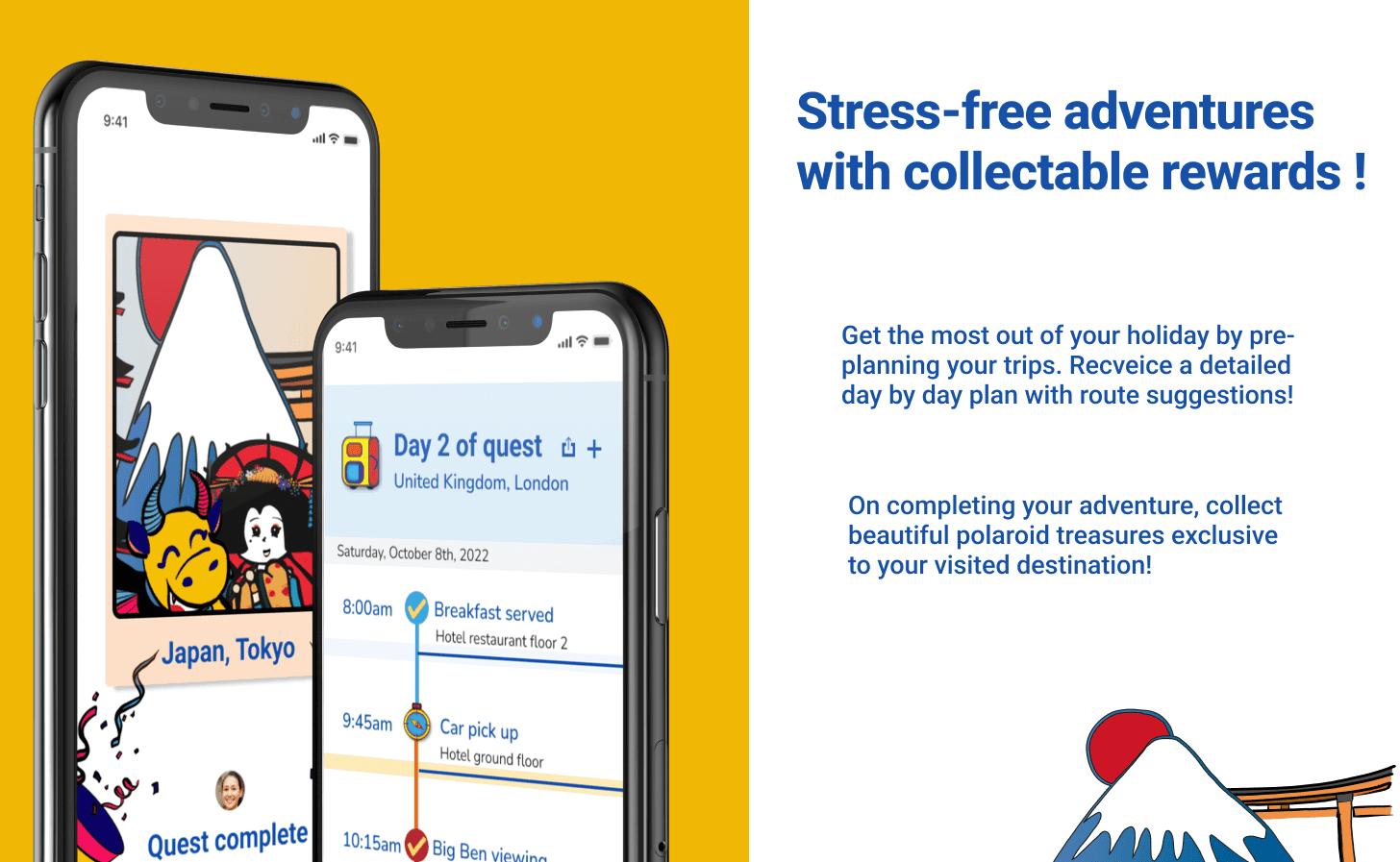
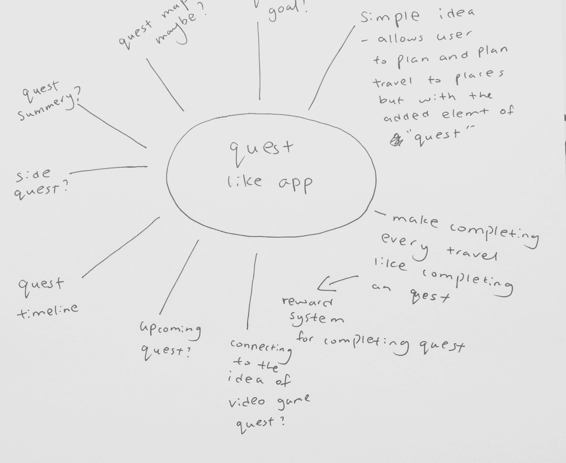
After some brainstorming, I came up with the idea of a travel app set up like a quest. The idea was inspired by my memories of playing adventure-type games as a young child/teen.
I thought it would be a unique idea to treat travel plans like quests and reward users with "treasures" in the form of digital collectables once they complete a trip.
User journey flow
User journey flow
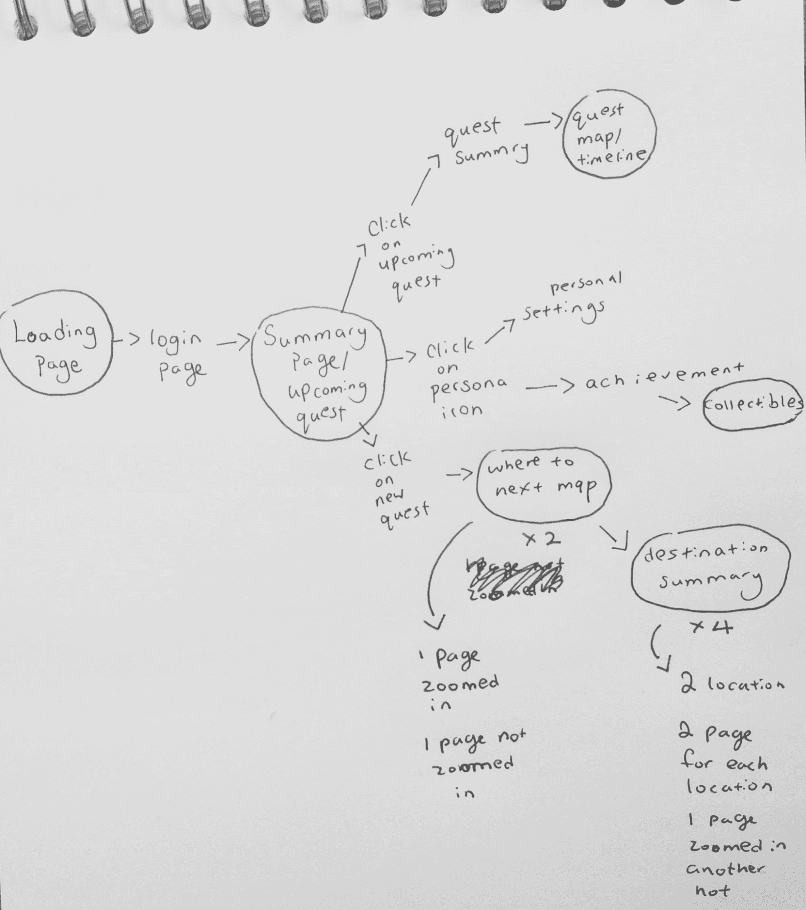
Next, I made a simple user journey flow for the app. As I could not prototype all the screens within my travel app, the user journey flow allowed me to see the bigger picture and determine which screens could best showcase the app. (circled in black).
Next, I made a simple user journey flow for the app. As I could not prototype all the screens within my travel app, the user journey flow allowed me to see the bigger picture and determine which screens could best showcase the app. (circled in black).
User journey flow


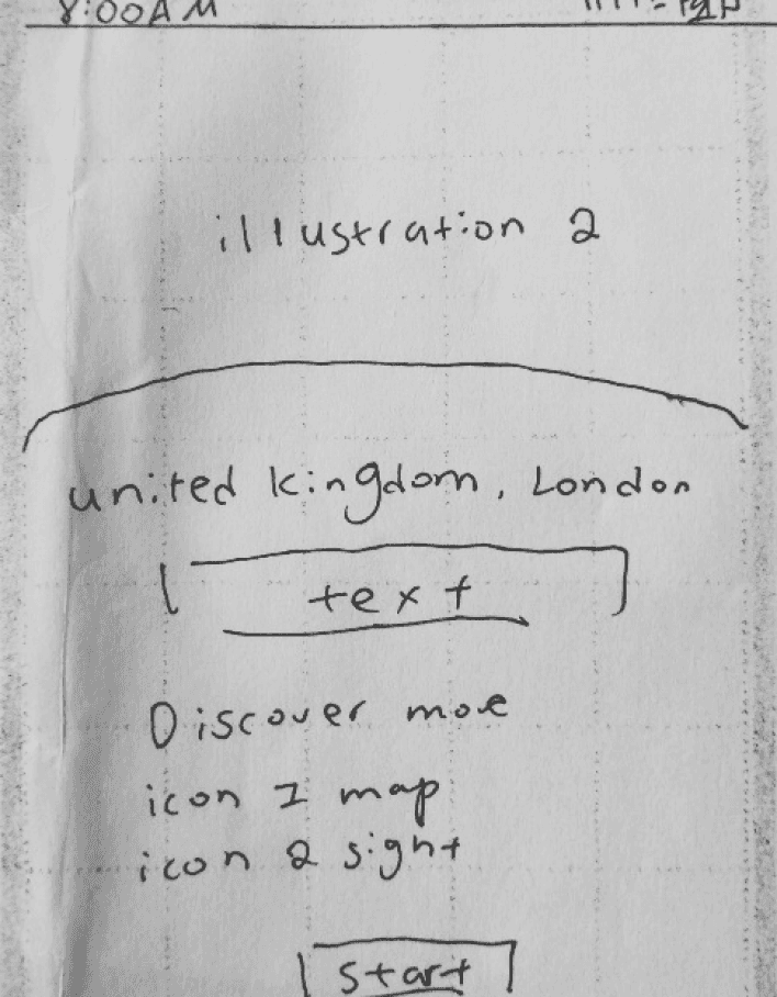
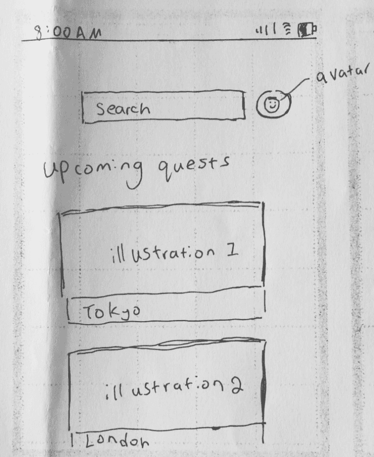


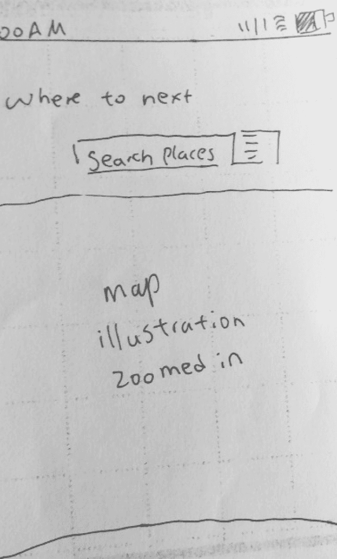

Once I knew what screens I wanted to prototype, I began to plan their layouts through wireframing.
At the same time, I was also studying other travel apps available on the market. Through this, I learned much about what designs/layouts worked and what didn’t, and I could apply what I have learnt in the layout design of my travel app.
Competitor analysis and wireframing
Illustrations and colours
Illustrations and colours
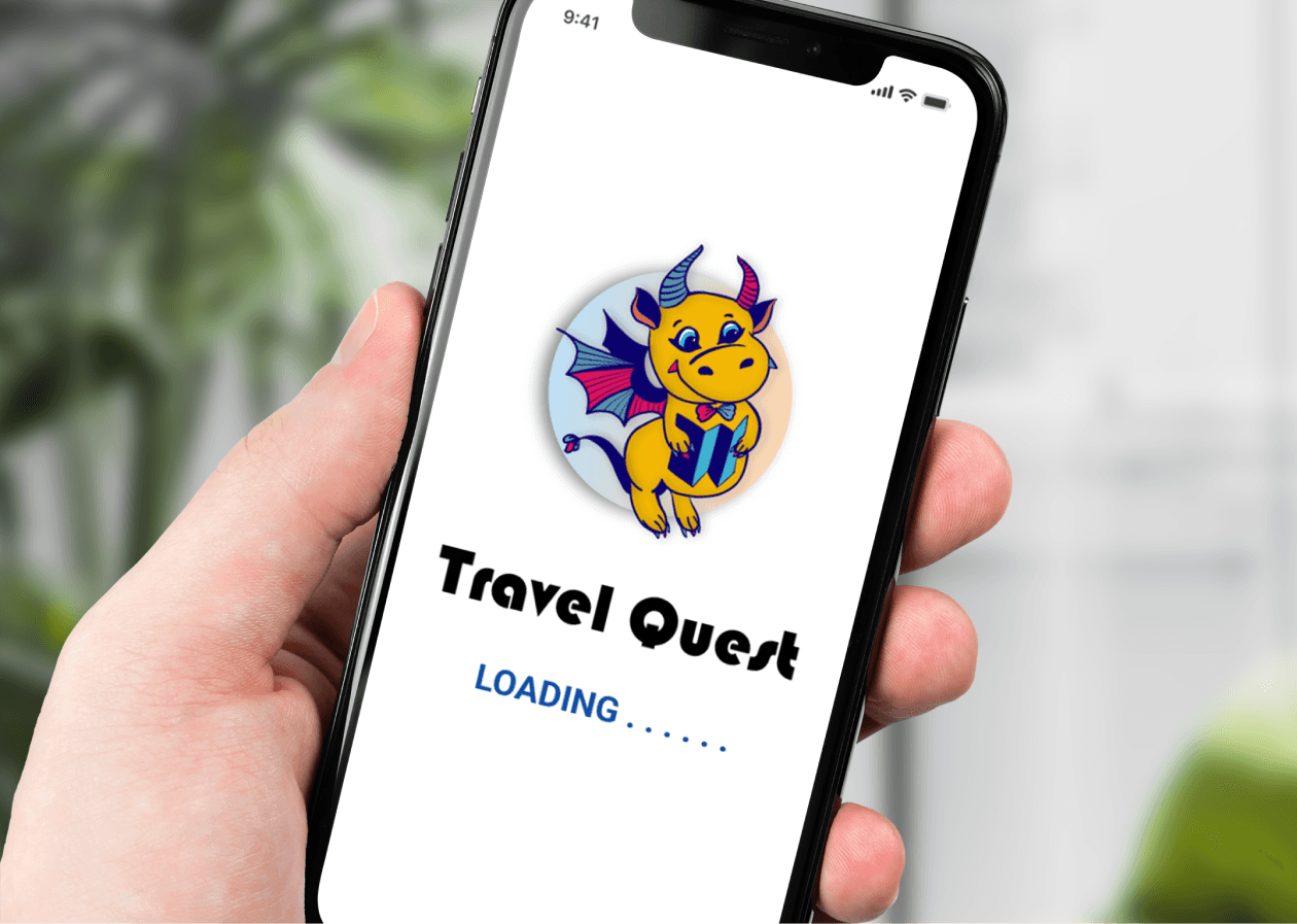
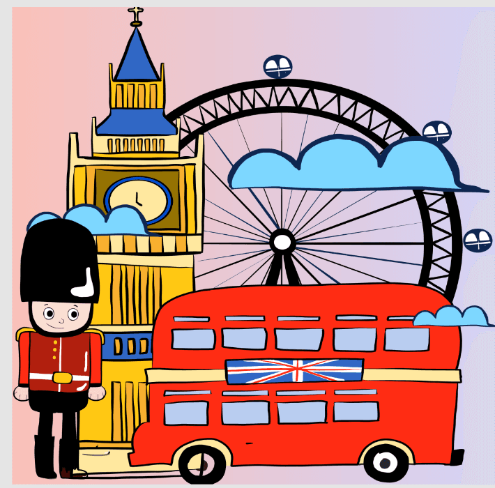
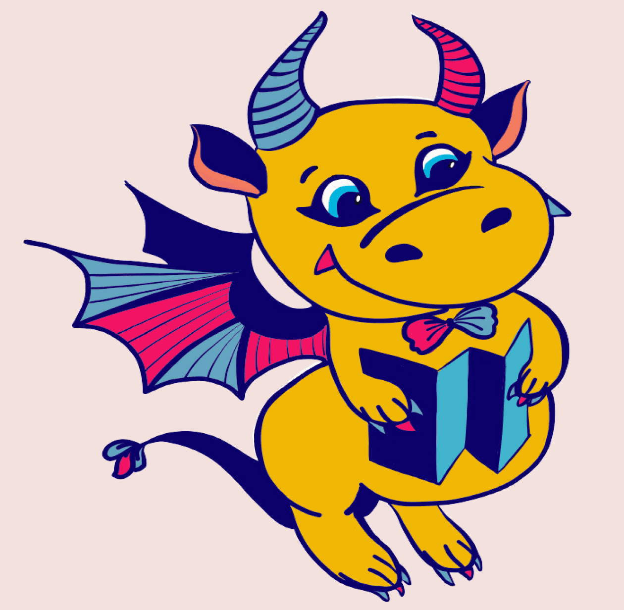
The logo of my app is a dragon, inspired by the fact that adventure games would often have a dragon character.
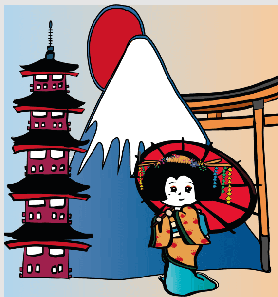
Since childhood adventure games inspired my quest-themed travel app, I wanted the illustrations to be childlike and cartoonish. I noticed that carton characters have big expressive eyes. and bubbly features. Thus, I tried to incorporate these features when drawing my illustrations.
In terms of colour, I choose a bright colour scheme that reflects the adventure-related feelings of positivity, excitement and youthfulness.


Illustrations and colours
Illustrations and colours
The logo of my app is a dragon, inspired by the fact that adventure games would often have a dragon character.
Since childhood adventure games inspired my quest-themed travel app, I wanted the illustrations to be childlike and cartoonish. I noticed that carton characters have big expressive eyes. and bubbly features. Thus, I tried to incorporate these features when drawing my illustrations.
In terms of colour, I choose a bright colour scheme that reflects the adventure-related feelings of positivity, excitement and youthfulness.
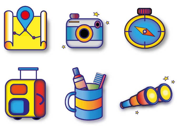
For my icons, I applied the same bubbly cartoon style found in my illustrations to their design.
Icons

For my icons, I applied the same bubbly cartoon style found in my illustrations to their design.
I experimented with different typefaces in Illustrator to find a good fit for my wordmark. I eventually chose Bauhaus 93 (typeface circled in red) because I like how this typeface is playful but modern at the same time.
For my icons, I applied the same bubbly cartoon style found in my illustrations to their design.
Icons
Icons & Typography
I experimented with different typefaces in Illustrator to find a good fit for my wordmark. I eventually chose Bauhaus 93 (typeface circled in red) because I like how this typeface is playful but modern at the same time.
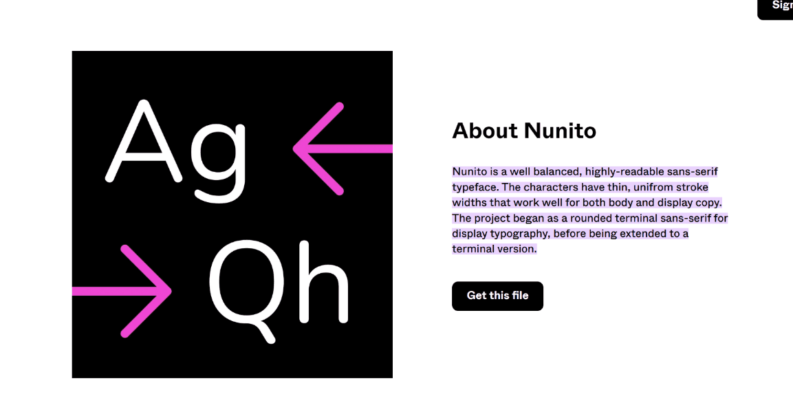
For the body font of my app, I decided on the font Nunito. I chose Nunito because it has good readability in paragraphs and in very small sizes. I also liked how this font comes in a variety of thicknesses; I found it very helpful when establishing type hierarchy in my app.
Typography
For the body font of my app, I decided on the font Nunito. I chose Nunito because it has good readability in paragraphs and in very small sizes. I also liked how this font comes in a variety of thicknesses; I found it very helpful when establishing type hierarchy in my app.
I experimented with different typefaces in Illustrator to find a good fit for my wordmark. I eventually chose Bauhaus 93 (typeface circled in red) because I like how this typeface is playful but modern at the same time.
For the body font of my app, I decided on the font Nunito. I chose Nunito because it has good readability in paragraphs and in very small sizes. I also liked how this font comes in a variety of thicknesses; I found it very helpful when establishing type hierarchy in my app.